
Planned Parenthood Toronto
Branding a bold and resilient voice for reproductive justice
Planned Parenthood Toronto is a community health centre dedicated to fostering an inclusive, youth-centred, and holistic approach to sexual and reproductive health for young people aged 13–29. As the organization expanded its services beyond sexual health to include mental health support, primary care, housing and employment navigation, and help navigating the health care system, its existing brand no longer reflected the full scope or complexity of its work.
Ryan and his team partnered with Planned Parenthood Toronto to lead a brand refresh that could clearly communicate this evolution—one that honoured the organization’s long-standing advocacy roots while making space for a broader, more integrated model of care.
The Challenge
Planned Parenthood Toronto was widely recognized for sexual and reproductive health services, but this narrow perception did not reflect the organization’s growing, holistic approach to youth wellbeing. The existing brand did not adequately communicate how interconnected health, mental wellness, housing stability, employment, and access to care are in young people’s lives.
The organization also needed a brand that resonated with Toronto’s underserved youth—including LGBTQ2S+ youth, racialized communities, newcomers, and those facing systemic barriers—while avoiding clinical language or visual cues that could feel intimidating or exclusionary.
The challenge was to evolve the brand without losing credibility, trust, or continuity with Planned Parenthood Toronto’s long-standing advocacy roots.


Approach
The work began with collaborative discovery sessions with staff and stakeholders to understand how Planned Parenthood Toronto viewed its role in young people’s lives—not only as a service provider, but as a partner and advocate.
Rather than positioning the organization as an authority, the strategy focused on youth agency, care as an interconnected system, and authentic representation. The brand needed to feel affirming, bold, and flexible—capable of supporting a growing range of programs while remaining clear and cohesive.

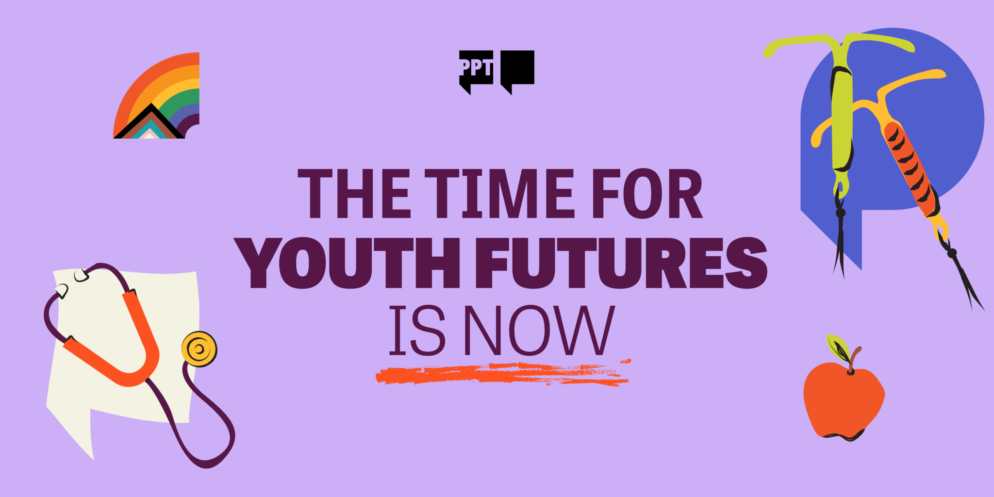
Solution
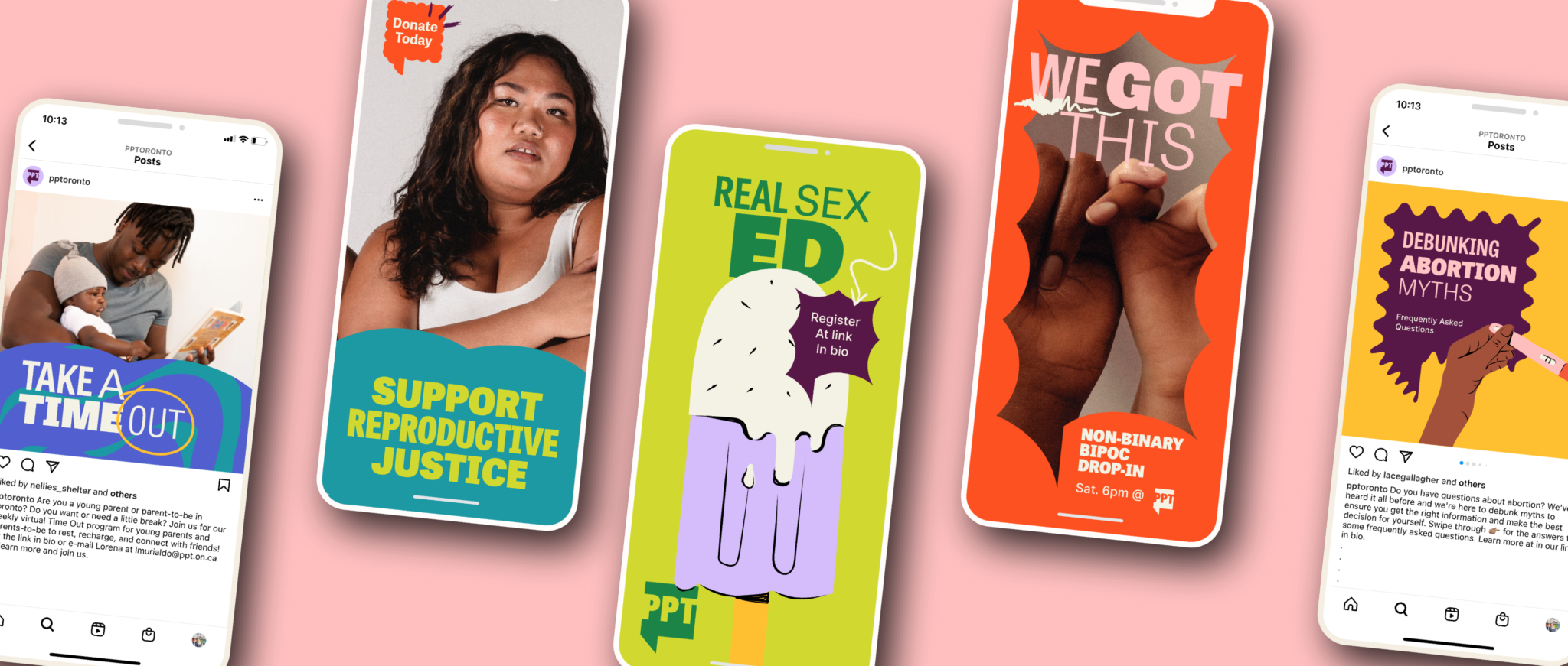
The resulting brand refresh is expressive, confident, and human. A bold visual system anchored in strong typography, vibrant colour, and flexible graphic elements allows the brand to adapt across programs, audiences, and touchpoints without losing clarity or recognition.
Messaging was refined to speak directly to young people in accessible, non-clinical language, reinforcing Planned Parenthood Toronto’s role as a trusted partner rather than an instructor. The system was designed to scale across digital platforms, printed materials, and in-clinic environments, supporting the organization’s expanding services and future growth.
The refreshed brand better reflects Planned Parenthood Toronto’s commitment to inclusive, holistic care and strengthens its ability to connect with underserved youth. It provides staff with clearer tools to communicate their work, helps young people see themselves reflected in the organization, and reinforces Planned Parenthood Toronto’s leadership in equitable, community-based health care.


